Thoughts about the TfL Rainbow Box
Posted: 1th December 2024. Last updated: 2th December 2024 (List Changes).
With the recent launch of the new Overground line names, the Tube Map and associated miscellanea have been updated with new elements to reflect these changes. This article isn’t going to go into debates around the line names themselves; they’re good and as I would argue the existing tube line names hold little meaning in the 21st Century beyond the historical, I’m not going to comment further.
What does warrant discussion is the wider issues around accessibility and the increasingly complicated nature of the wider support infrastructure around the Tube Map. This article is not going to be a criticism of the Tube Map in of itself. Is the map perfect? No. But is it a surprisingly competent map for the information density they have to convey with it? Yes. It’s shockingly good. I would go as far as to say that it’s current incarnation is actually doing a reasonable job of managing the complexity it has to. Of most important is the separation of systems, so let’s discuss those first.
Just to make it very clear: I am in no way affiliated with TfL beyond being a user of their transport system. Do not take anything here as official TfL material unless otherwise stated. This is all intended as criticism and review.
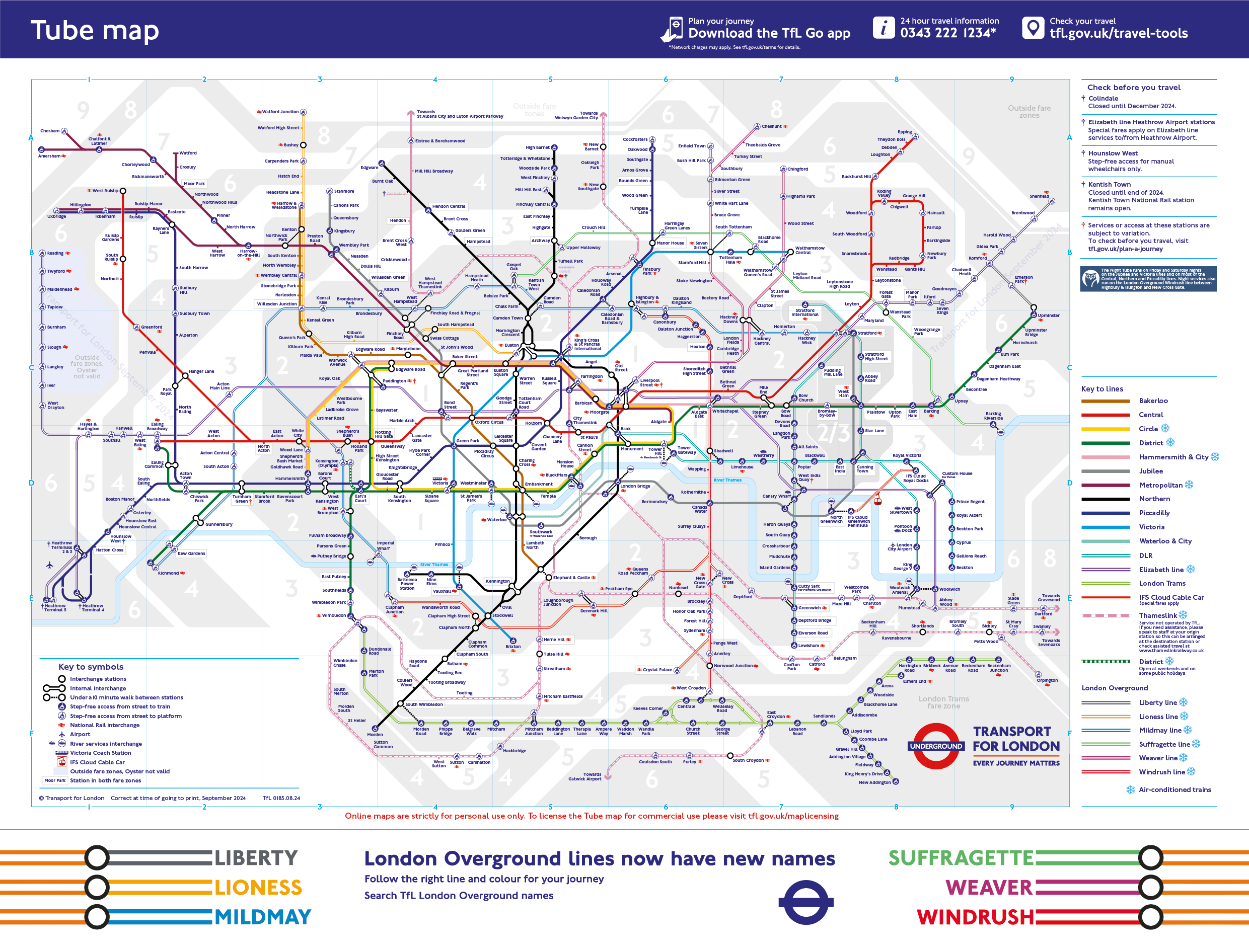
The TfL Railway Systems
Transport for London is the operator of several railway systems that have a long and intertwined history with each other. Categorising the lines that make up the greater TfL railway network is something that’s fought with disagreement and often quite heated debate, however I will provide a taxonomy here that I hope I can justify, as well as one that I hope you (the reader) find useful.
The Metro
The “Metro” system is made up of the lines that have traditionally been under the control of London Underground. These are the traditional solid coloured lines on the map and in alphabetical order are:
- Bakerloo
- Central
- Circle
- District
- Hammersmith and City
- Jubilee
- Metropolitan
- Northern
- Piccadilly
- Victoria
- Waterloo and City
Some might argue that these names hold geographical significance, however I would argue the only one here with any true semblance of geographic significance is the Waterloo and City, which (for those who don’t know) connects the City of London with the Waterloo National Rail station. In the cases of others such as the Hammersmith and City or Central, it is somewhat academic to call them “geographic” line names and are a historical holdover.
TfL’s Metro services are characterised by (generally) high frequencies, relatively high capacity trains and increasingly automatic (although not universal) train operations. These services are also all characterised by their use of the four rail power system, however I would say this is again, something of an academic discussion in this context.
The S-Bahn
The Germans have a wonderful name to describe a hybrid system of both suburban and urban railway systems - the S-Bahn. TfL has two S-Bahn services that currently live under two different names, those being the Overground network and the Elizabeth Line. These services are characterised by relatively high frequencies, but often less than that of the Metro services, a branching network, full size “National Rail” rolling stock and a service that serves the suburbs (or even further afield) while also serving a somewhat dense network of urban stations. On the current Tube Map they are:
- Elizabeth Line
- Liberty Line
- Lioness Line
- Midmay Line
- Suffragette Line
- Weaver Line
- Windrush Line
Another service on the Tube Map that is not a TfL service is Thameslink. Thameslink also falls in to this category of S-Bahn service, however it is (for some inexplicable reason) not a TfL service. Historically the current name “Thameslink” comes from 1988 and British Rail, eventually falling under Network SouthEast’s control. With the privatisation of British Rail, Thameslink became it’s own franchise (much like the Overground was). I personally feel that Thameslink should become part of TfL’s remit. It’s very similar to another service in this category (the Elizabeth Line) is primarily a commuter service for London. It baffles me why the DfT haven’t just handed them this one.
The “Other” Category
I’m not quite sure what to call this category. This is the other systems that TfL run that are weird and could fall into several categories. These systems are the Trams (formerly the Croydon Tramlink), serving parts of South London and the Docklands Light Railway (DLR). The DLR is a strange system. If we use Gareth Dennis’ #NotAMetro Sorter, (assuming between 17,000 and 25,560pphpd,1 it is a metro system. However, TfL classify it as it’s own separate system. For now, I will also leave it in this “other” category, as dissecting the DLR would be an essay in it’s own right.
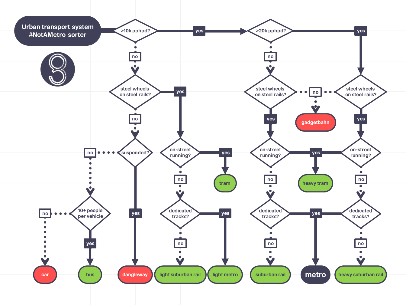
As for the trams? It’s a small system that hangs out in South London that is very much a tram. Sadly it doesn’t have the love it deserves, nor the expansion. Personally, I would have the tram network expanded drastically (think on the scale of Melbourne’s), while also moving them to their own map.
For the purposes of this essay, these two systems will exist in this “other” grouping.
The Problem
The problem isn’t the Tube Map itself. Instead, the problem is seen on TfL’s website with the wonderfully named “Rainbow Box”. To you or I, the line status box on the left hand side of the screen.
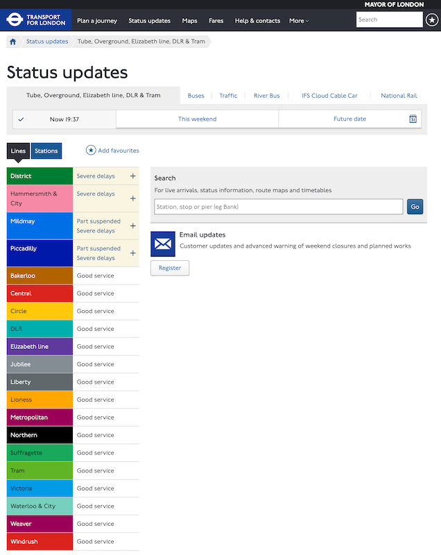
There are several issues with how this information is displayed. To make it clearer, let’s compare the current Rainbow Box with one from July of this year.
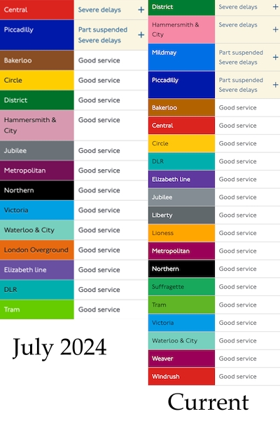
The old (July) box, while having fewer items, demonstrates the biggest issue with the current box - there are too many similar colours on the list. It is frustrating just how badly this has been done! Some of the offenders are the following pairs (along with their CSS hex codes):
- Central (
dc241f) and Windrush (bd0404) - Metropolitan (
9b0058) and Weaver (9b0058) - Liberty (
61686b) and Jubilee (838d93)
If I’m being totally honest, all the new lines clash with, or are identical to, the existing colours. This is not an issue on the Tube Map; the Overground lines get their own special way of being displayed (coloured borders with a white middle), but here any sort of care has clearly been forgotten.
How do you fix this?
Starting Small
Firstly, we’re fixing the way the lines are displayed. Personally, I’m fine with the new colours on the map. They’re fine and honestly there’s only so many hues someone can be reasonably expected to differentiate at a glance. Instead, I propose we start by copying the Tube Map and using the borders to show off the line differences.
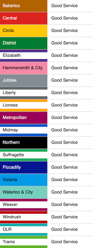
In this demo, you can see that I have implemented the Overground’s bordered style found on the Tube Map to the Rainbow Box. This has also been applied to the Elizabeth Line, Trams and DLR, as they too follows the “Overground style”. I have, however, left it in the default alphabetical grouping that TfL has decided on. At a minimum, I hope that TfL implements something like this to help improve both accessibility (colourblindness!) and reduce confusion.
This is an improvement on the current design, however it does have a couple of problems. Firstly, it equates the Trams, DLR, Elizabeth Line and Overground services as all equal. They are not equal as they have vastly different service patterns and system capacities. Secondly, it just looks messy with the interspersing of bordered vs filled identifiers. This is where we return to my taxonomy of TfL rail services.
Taxonomising the Railways
Using my proposed taxonomy from earlier, we can quickly sort the Rainbow Box into three visually distinct categories - Metro, S-Bahn and Other. When applied to the previous demo, we get a visually pleasing and organised Rainbow Box that’s easy to find the line(s) of interest at a glance.
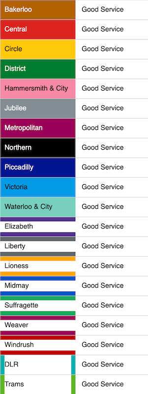
This design mitigates the colour similarity issue, while also categorising the services very neatly into like-for-like services. By doing this, it is not only quicker to read, but it is also visually appealing in a way that the previous alphabetised design was not. This taxonomy, while imperfect, at least follows (most) of the Tube Map’s lead. I have differentiated the DLR and Trams, as they are not an S-Bahn service. As I’ve said, one is more of a metro and the other is, well, a Tram!
An interactive demo version of the Rainbow Boxes can be viewed here.
Thinking Longer Term
Thinking in a longer term way, TfL’s current system of wayfinding2 and journey planning needs a rethink. The current system has been described as “a system governed by exceptions more than the rules” and I would be inclined to agree. This is not to say the current standards are bad, far from it. TfL’s current wayfinding standards have been the base of, or inspiration for many other transit system’s wayfinding standards the world over. TfL has world renowned graphic design and typography and a very strong corporate image that can and should be preserved by any new standard moving forwards.
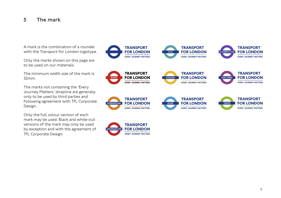
To begin with, let’s consider out taxonomy from earlier and work from there. Considering the Basic Elements Standards, as well as TfL’s Colour Standards, let’s design an image that we can use for the basis of our new system.
A quick note about fontsAs I do not have access to TfL's Johnston 100 and New Johnston typefaces, I will be using the open source "Railway Sans" by Greg Flemming as a stand in.
General System Branding
Let’s start off by giving our four main systems (Underground, Overground, Docklands and Trams) their own colours. I’ve stuck with what’s in play here, as per the Colour Standard manual. Each system has, however, received a letter associated with it and this will come in later with line identification.

The Underground
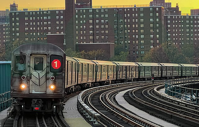
For our “Metro” services, we will retain the Underground branding. It’s stood strong since 1912, so there’s little point in changing it. It’s a good brand with a great history. I have, however numbered the lines too. While this seems a little superfluous at first glance, this is instead intended for use on trains and wayfinding signage to make it easier for people to find their correct trains, much in the same way that the New York Subway does.There was no special method for choosing the numbers; they were assigned alphabetically.
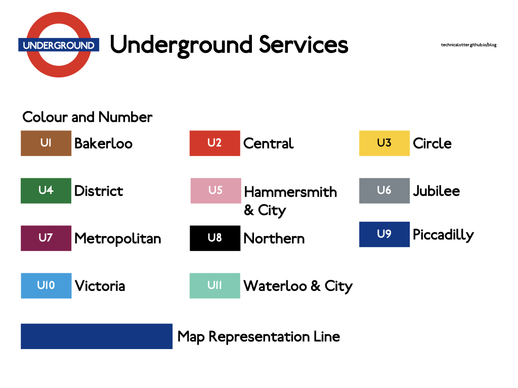
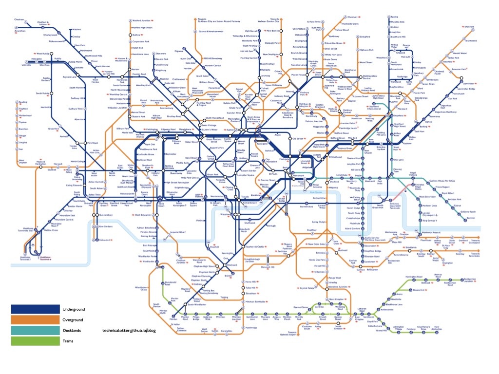
The “Map Representation Line” is intended for use on the full system map, depicting the four systems in no more detail than where each system serves and interconnects. Line detail is to be reserved for individual maps of each system.
The Overground
Our “S-Bahn” services are to retain the “Overground” branding that’s been in play since 2007. Once again, it’s a solid brand with generally positive associations (especially when compared to it’s predecessor, Silverlink), so it will remain.
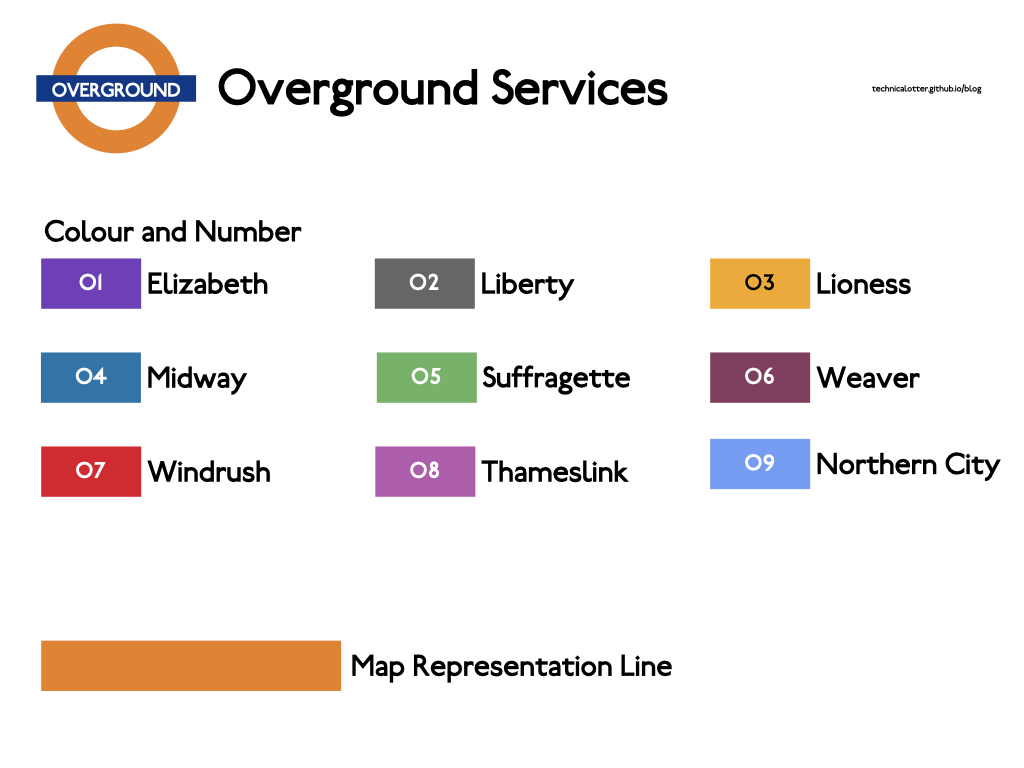
You may notice that I’ve included the Elizabeth line (as well as the Thameslink and one Greater Nothern services) as part of this. The Elizabeth line being a separate “mode” always felt rather stupid to me. I could break it off into it’s own system (along with Thameslink and the Northern City services), as Gareth did, however I do not feel that it is necessary. They’re all “Suburban Rail” services and should be treated as such. If anything, bits of the network could do with some infrastructure fixes to help tidy it up (such as consolidating Canada Water and Rotherhithe into one station).
The DLR
As we have discussed, the DLR is a metro system in it’s own right. Let’s treat it as such and give it it’s own strong identity. I have split it up into six lines, as that’s the services that currently run on the system. The line colours are derived from the existing ones, as well as adding “inbetween” ones by averaging the middle between them.
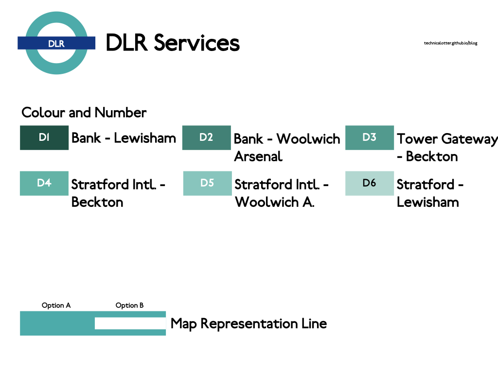
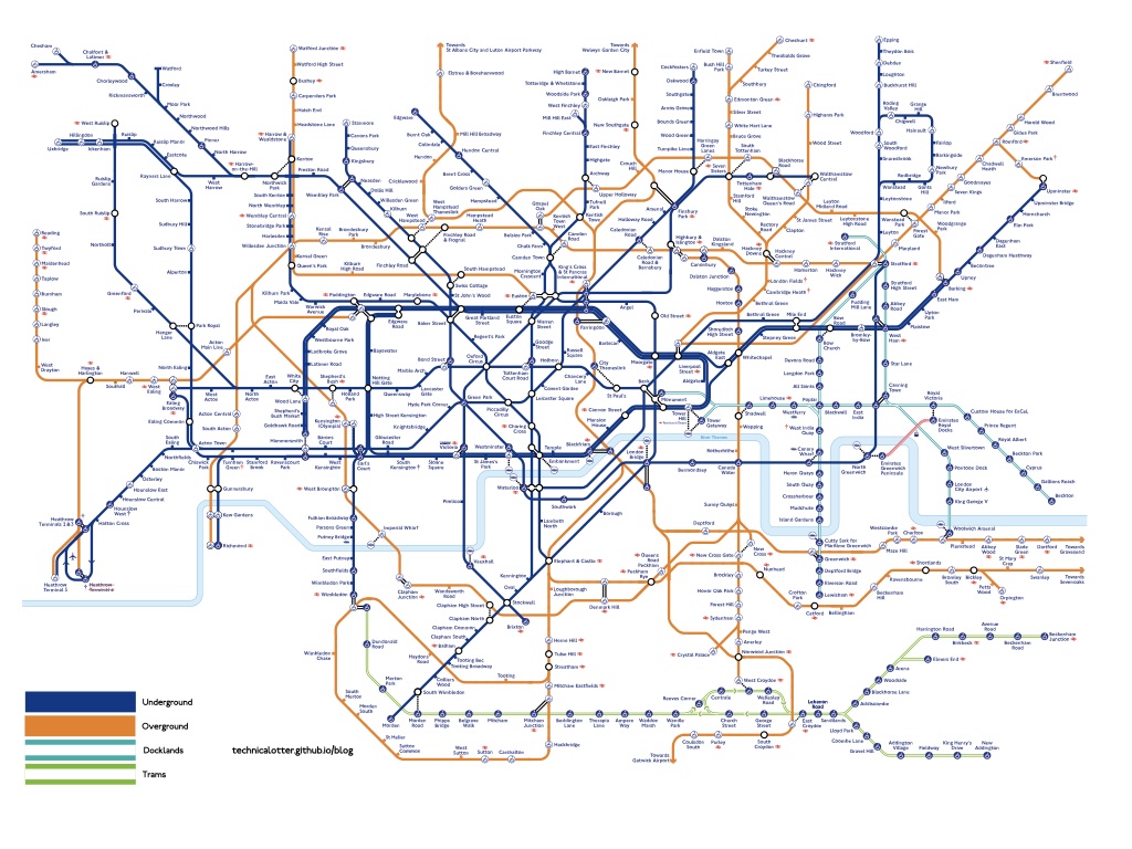
You may wonder what the “Option A” and “B” is with the map representation. I was unsure if I wanted to keep the striped look on the overview map, so created two options. I’ll let you decide which one you prefer later.
Trams
London’s current tram network is pathetic. However as TfL is keeping it on the map, I’ve decided to retain it. Should the network expand beyond the current system, I may suggest we re-evaluate it’s inclusion. For now, it stays and has it’s old line numbers returned (albeit with the new service patterns).
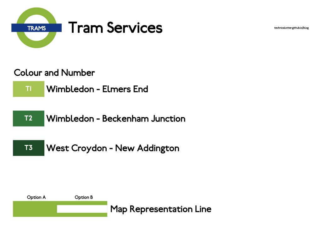
A System Map
Each of the systems mentioned above will get their own map showing only their services (with interchange points marked). I am not going to even begin to try and draw them. I will show a very rough example of the overview maps proposed. These are very rough and were made by taking an SVG that was released via FOI in 2021 and recolouring the lines in Inkscape. I didn’t do one with the Overground in the “Option B” style, mostly because it was getting late (shh!). It’s rough, it’s messy but it just about gives you an idea of what the overview map could look like. I apologise to TfL’s designers in advance for the visual assault you are about to experience.
The Option A colours:
The Option B Colours:
Station Signage
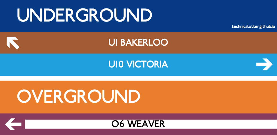
I’m not a signage designer, but as I have created new system identities, I thought I’d demonstrate how they could be used on a sign or two. Again, sorry to the professionals.
Conclusions
As we have seen, the current TfL Rainbow Box is not quite fit for business. This can, however be fixed. At minimum, I would suggest that TfL uses the filled line style to differentiate the Overground on the current Rainbow Box.
As for the wider design questions? I’m no designer. This was me throwing things at the wall. But hopefully it’ll inspire people to have a think and question what they’re seeing in the world around them. Designs can change even when there’s a lot of history and precedent set - look at the renaming and colouring of the Overground lines.
I recently went to the Harry Beck exhibit on at The Map Room in Knightsbridge with my friend Amir. While we were there, Amir remarked at how the dimensions of the Tube Map have essentially remained the same as the original ones that Beck chose all those years ago. We’re now displaying double the number of stations and many, many more lines than he ever had to display, along with accessibility information to boot. Maybe it is time to think about changing the dimensions and design of the map. It’s served us well and given us the wayfinding we use today, but maybe it’s past it’s prime.
Addendum
One problem with the way that the new Overground line names has been done is that it makes it difficult to incorporate London’s vast network of suburban rail services into the system (as would happen if/when TfL takes them on). If this happens, this is the time to rip up the rule book in it’s current form and start fresh.
Acknowledgements
This article was inspired by a chat with Amir Dawoodbhai.
Thanks to Gareth Dennis for allowing me to use his #NotAMetro sorter.
The image of the NY Subway train is by EmperorOfNYC. CC-BY-SA 4.0 via Wikimedia commons.
I’m sorry to everyone at TfL’s design teams who may be upset or offended by my ham-fisted attempts to revise your designs.
Changes
Content changes are denoted in bold.
2nd December 2024
- Minor formatting change on font note in Thinking Longer Term.
1st December 2024
- Initial release.